Hatch Rebrand
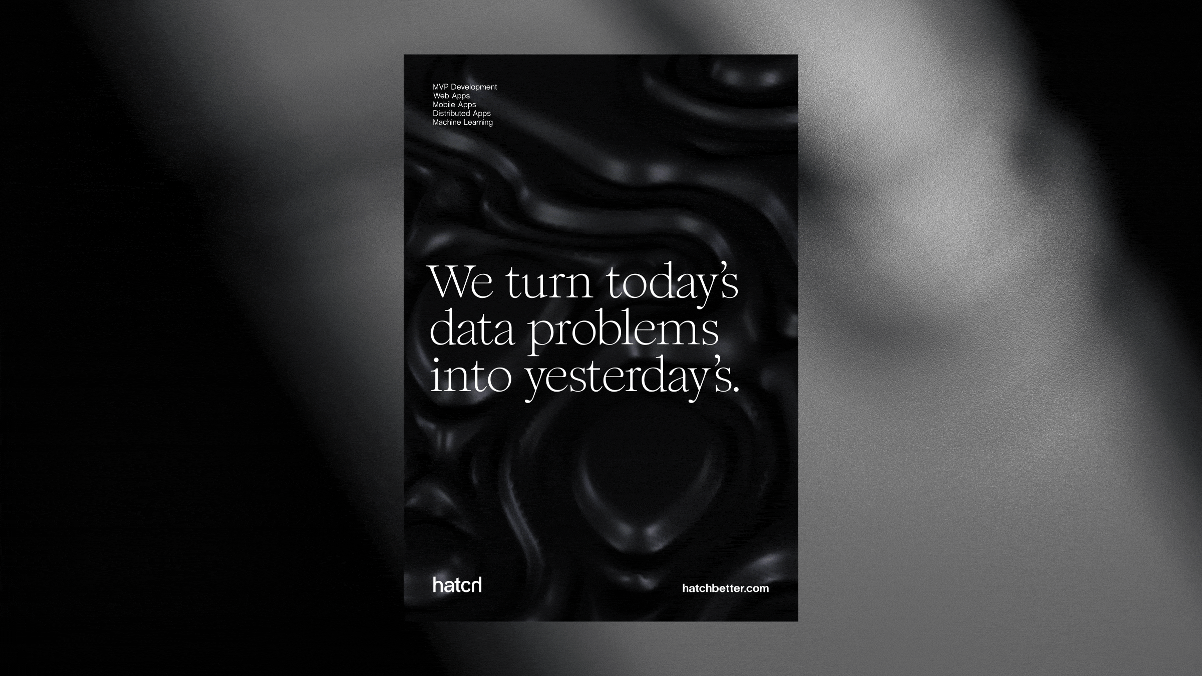
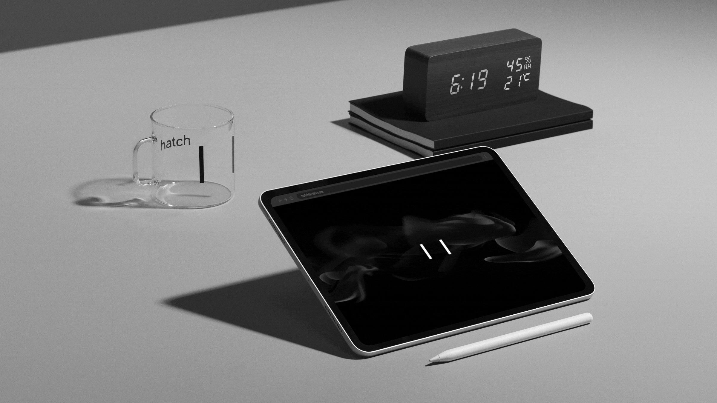
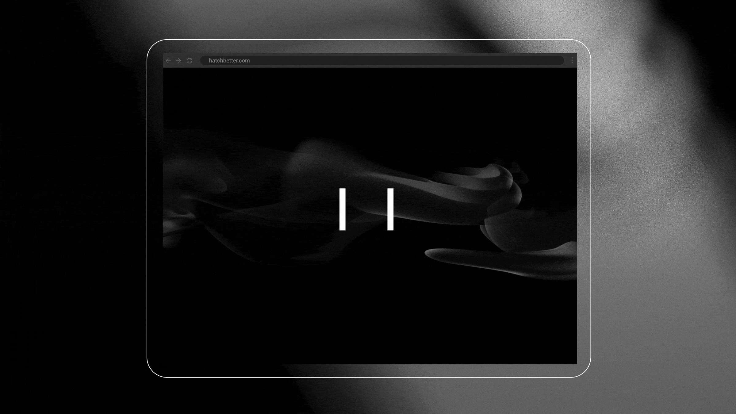
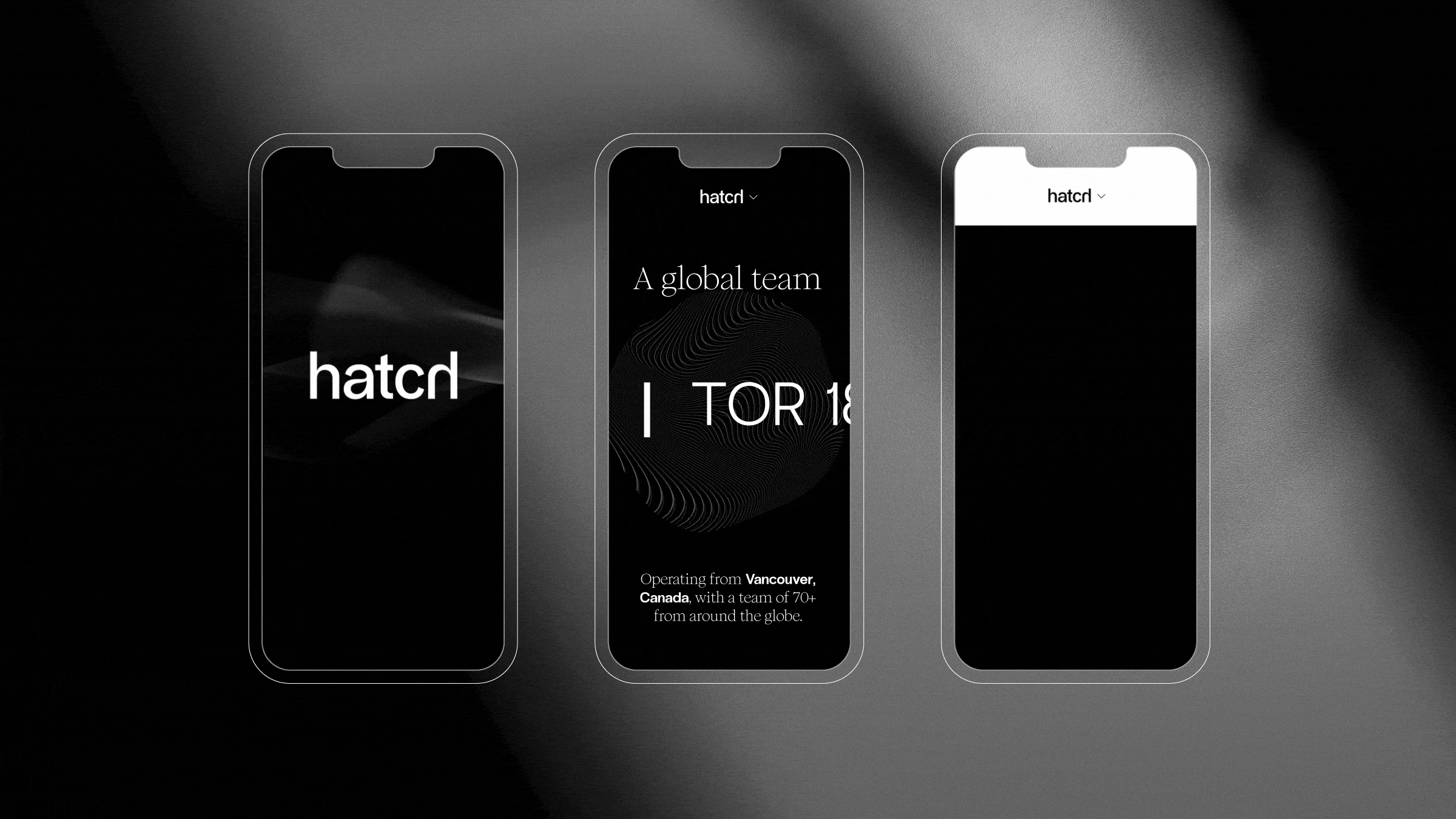
Hatch is a software development company, whose simple and thoughtful approach to solving problems wasn’t represented in their previous visual identity. Instead, their identity felt outdated, corporate, and undifferentiated in the competitive technology market.The new identity is a direct reflection of their new brand platform: “Embracing change in the pursuit of better.” As change can be beautiful and serve as an opportunity to innovate and simplify, their identity aims to do the same.Their new logo is simple, modern, and modular, hatching to reveal itself. The two bars in the logo contain imagery and words, ever-changing and always in motion, and act as a connection between innovation and creativity. The colours are stripped back, allowing focus on eye-catching graphics that are complemented with simplified typography.In the world of software where change is the one constant, Hatch embraces the new with whole-hearted curiosity. It’s about testing, learning, adapting and improving—constantly—to stay ahead of the innovation curve and so does its new brand identity.